As many smartphones now come with near bezel-less designs, Google shows off the gesture based navigation of Android P instead of the usual back, home and recent buttons.
However, it looks eerily similar to how users navigate on the iPhone X. That one was a necessary change since the phone ditched the home button in favor of an ‘edge-to-edge’ screen with a notch.
How does it work?
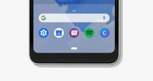
A small line or dash replaces the circular home button. Tapping on it returns the user to the home screen while a long press opens the Google Assistant.
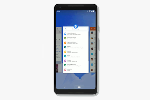
To open the recent apps, the user has to swipe up then scroll sideward. The recent apps are presented in small windows and is now called Overview. A direct swipe upward will open the app drawer.
There’s still a back button but it only appears when it’s needed.
Android P
The new system navigation will come with Android P which is currently available for a few smartphones in its beta version.
Its final release version will be available sometime in the fourth quarter of the year. I’m hoping to see the gesture based navigation in custom skins of other manufacturers though.
Source: Google
